Liquid Glass Explained: What It Is and How to Customize It on Apple Devices
Did you know? When Apple rolled out Liquid Glass, users reported that their iPhone interfaces suddenly felt alive, like the UI was breathing. That’s not just hype—this new system layer is more than a blur; it’s a living, reactive design that adapts to your wallpaper, widgets, and movements. If your device feels stale, Liquid Glass is Apple’s answer.
In this guide, you’ll learn what Liquid Glass is, where it appears on your iPhone, Mac, Apple Watch, and Vision Pro, and exactly how to tweak it for readability, performance, and style.
What Liquid Glass Actually Is
Think of Liquid Glass as a “living layer” between your content and background:
- It samples wallpaper and app colors to tint panels so text stays readable.
- It simulates depth and refraction, making sheets, menus, and controls feel like real glass that moves with your touch or gestures.
- It reacts to motion and focus with highlights, shadows, and parallax to guide your eyes naturally.
Where You’ll See Liquid Glass
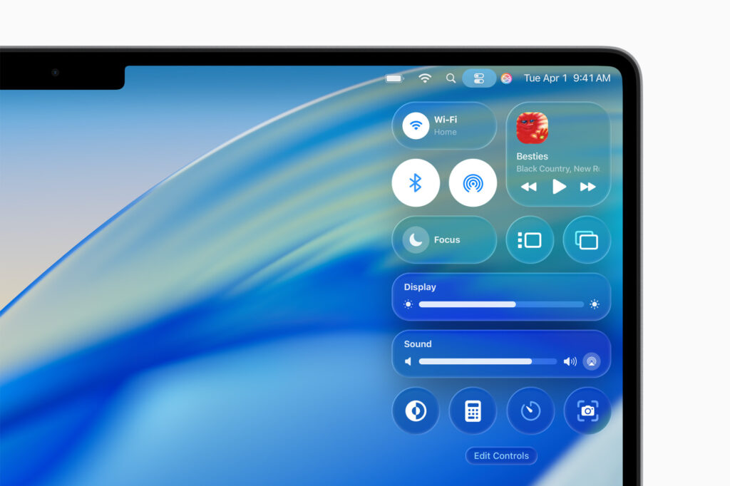
iPhone (iOS 26+)
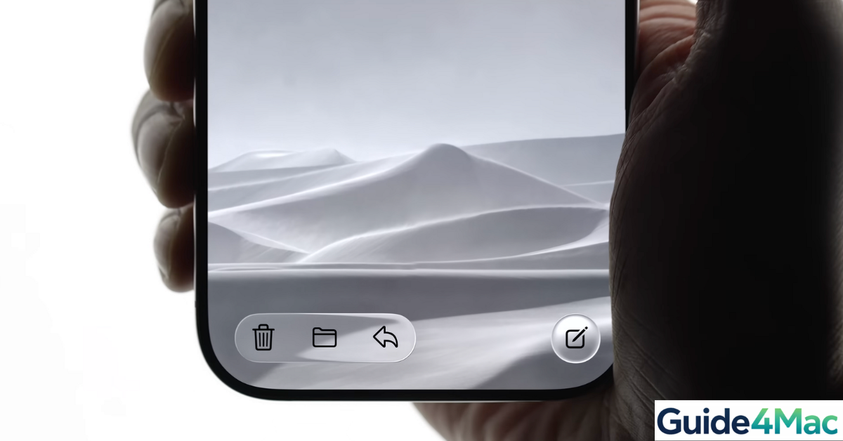
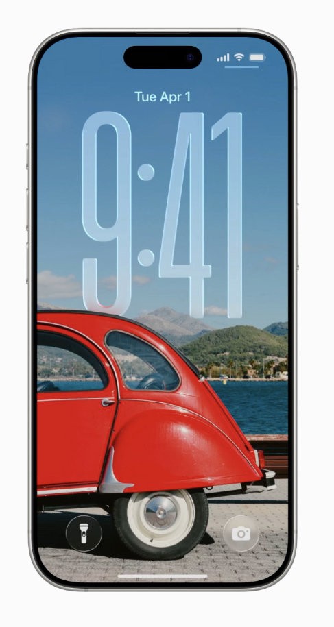
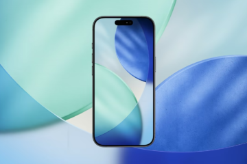
Lock Screen & Home Screen widgets: panels pick up wallpaper colors dynamically.
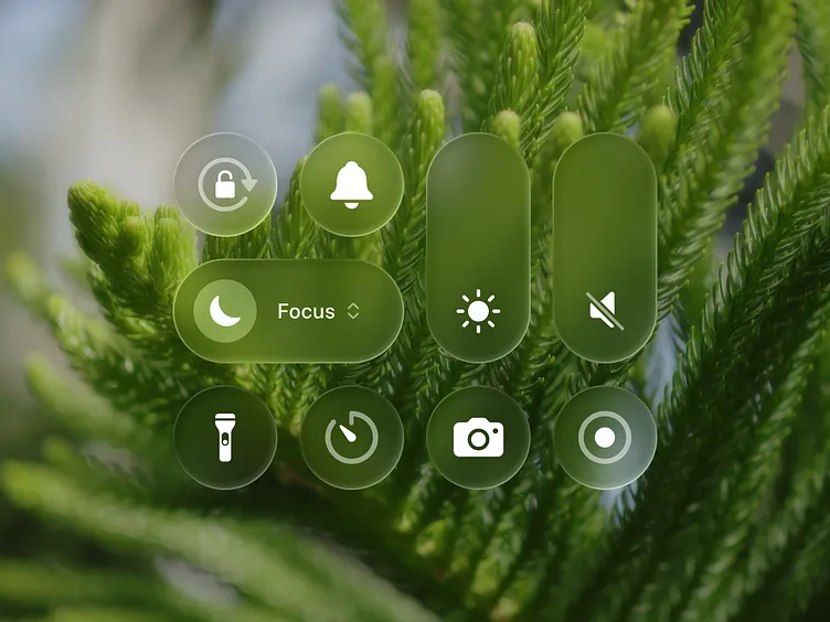
Control Center & Notifications: glassy translucent panes with sharper text.
Menus & System sheets: smoother edges, softer shadows.
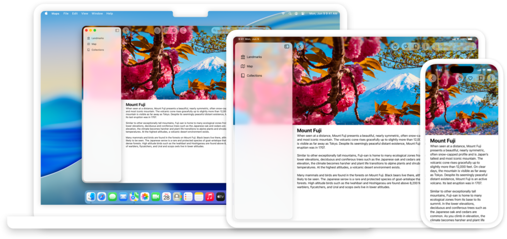
Mac (macOS Tahoe)
- Sidebars, menus, and popovers adapt to desktop wallpaper.
- Core apps like Safari, Messages, and Notes show fluid, readable panes.
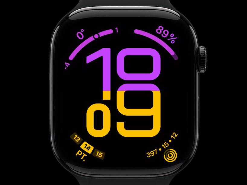
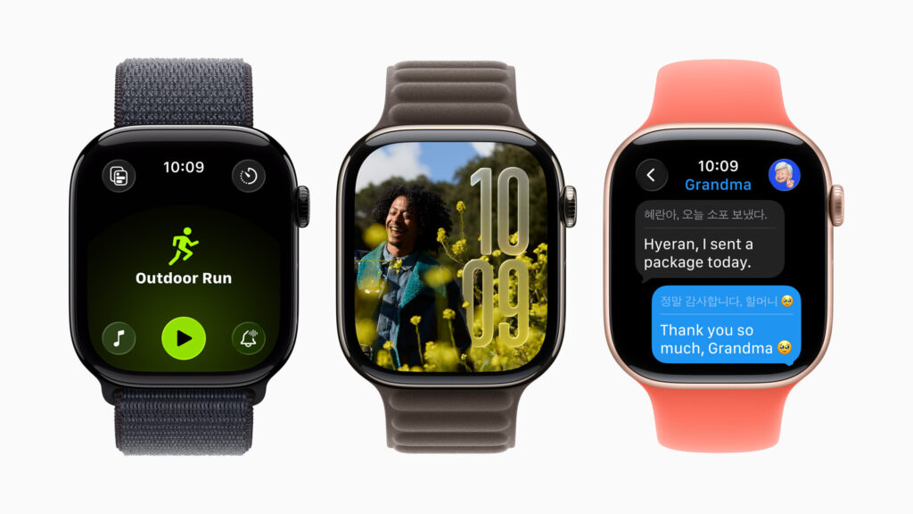
Apple Watch (watchOS 26+)
- Flow watch face: numerals refract colors as you move your wrist.
- Smart Stack: layered cards with depth cues for easier navigation.
Vision Pro (visionOS 26+)
- Spatial widgets and panels react to light and depth, giving your UI a sense of presence.
How to Customize Liquid Glass
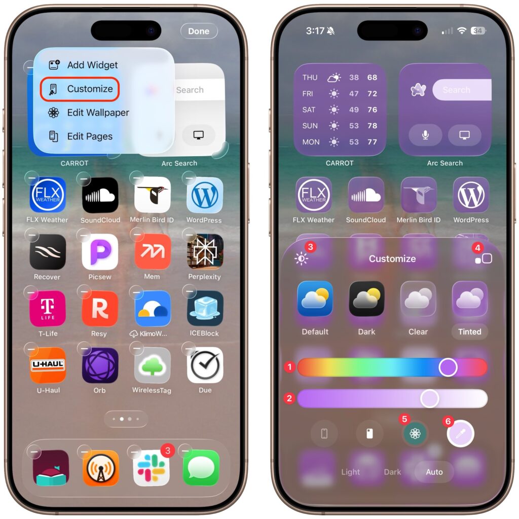
On iPhone
- Pick a friendly wallpaper: Settings → Wallpaper → choose calm, even tones.
- Tune lock screen widgets: Long-press Lock Screen → Customize → adjust size/order.
- Control Center layout: Settings → Control Center → reorder tiles.
- Improve clarity (optional): Settings → Accessibility → Display & Text Size → Increase Contrast or Reduce Transparency.
- Motion comfort: Settings → Accessibility → Motion → Reduce Motion.
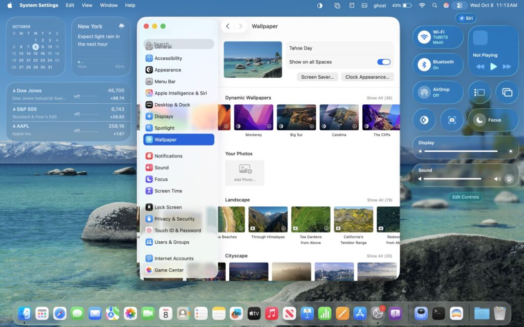
On Mac
- Appearance basics: System Settings → Appearance → Light/Dark/Auto.
- Desktop tinting: System Settings → Wallpaper → choose calm images.
- Legibility: System Settings → Accessibility → Display → Increase contrast or Reduce transparency.
On Apple Watch
- Use Flow: touch-and-hold watch face → Edit → select Flow → pick a color family.
- Smart Stack: rotate Digital Crown to surface correct cards; rearrange in Watch app.
On Vision Pro
- Place or resize spatial widgets; avoid stacking too many in one zone to keep focus.
Quick Tips for Smooth Performance
- Reduce Motion or Transparency if battery drops or animations feel too busy.
- Stick to simpler wallpapers for max clarity.
- Use Increase Contrast for better legibility over flashy backgrounds.
FAQs?
No, but Reduce Transparency + Increase Contrast makes panels more solid.
Yes, but calm images give the best effect.
Nope—what you see is what you capture.
No, it guides attention and encodes hierarchy for faster UI comprehension.
0 Comments