How to Disable Liquid Glass on iOS: Step-by-Step Guide
If you want to disable the Liquid Glass effect on iPhone, you are probably noticing the new translucent interface elements introduced in recent iOS versions. Apple redesigned several parts of the interface with glossy, glass-like transparency that changes based on background content.
While many users enjoy the visual style, others find it distracting or harder to read. Fortunately, iOS includes accessibility settings that reduce transparency and minimize these glass-style effects. In this guide, you will learn how to disable the Liquid Glass look and make your interface easier to read. If you are exploring other interface tweaks, you may also want to see how to remove the white icon borders in iOS.
Why Does iOS Use the Liquid Glass Interface?
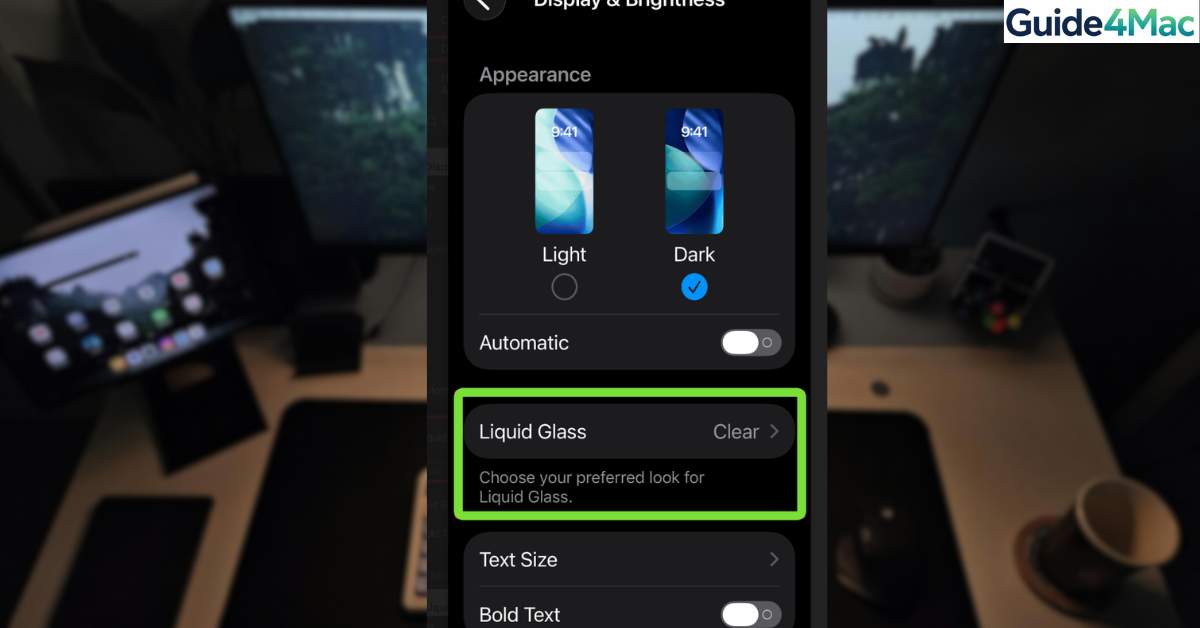
The Liquid Glass design style introduces layered transparency across menus, Control Center panels, widgets, and system backgrounds. Apple uses this design approach to make the interface feel more dynamic and visually integrated with the wallpaper behind it.
However, transparency can reduce contrast, especially in bright environments. Some users may experience readability issues when menu text overlaps busy backgrounds. Apple addresses this by providing accessibility settings that reduce transparency and increase contrast.
The solutions below help minimize or disable the Liquid Glass visual effect.
1. Turn On Reduce Transparency
The most effective way to disable the Liquid Glass effect is enabling the Reduce Transparency accessibility setting. This replaces translucent UI elements with solid backgrounds.
Steps to reduce transparency on iPhone
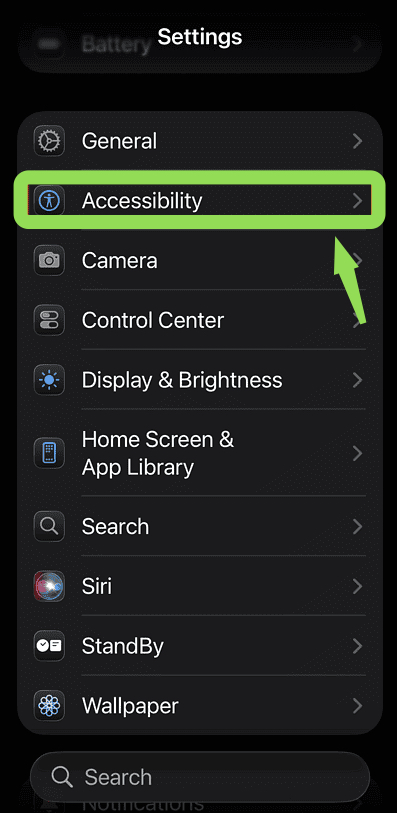
1. Open Settings
2. Tap Accessibility
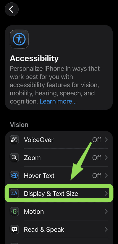
3. Select Display & Text Size
4. Turn on Reduce Transparency.
After enabling this option, menus and panels will appear with solid backgrounds instead of glass-like effects.
2. Enable Increase Contrast
Increasing contrast strengthens text visibility and improves readability in many parts of the interface.
This setting works well together with Reduce Transparency to minimize visual distractions.
Steps to increase interface contrast:
- Open Settings.
- Tap Accessibility.
- Select Display & Text Size.
- Turn on Increase Contrast.
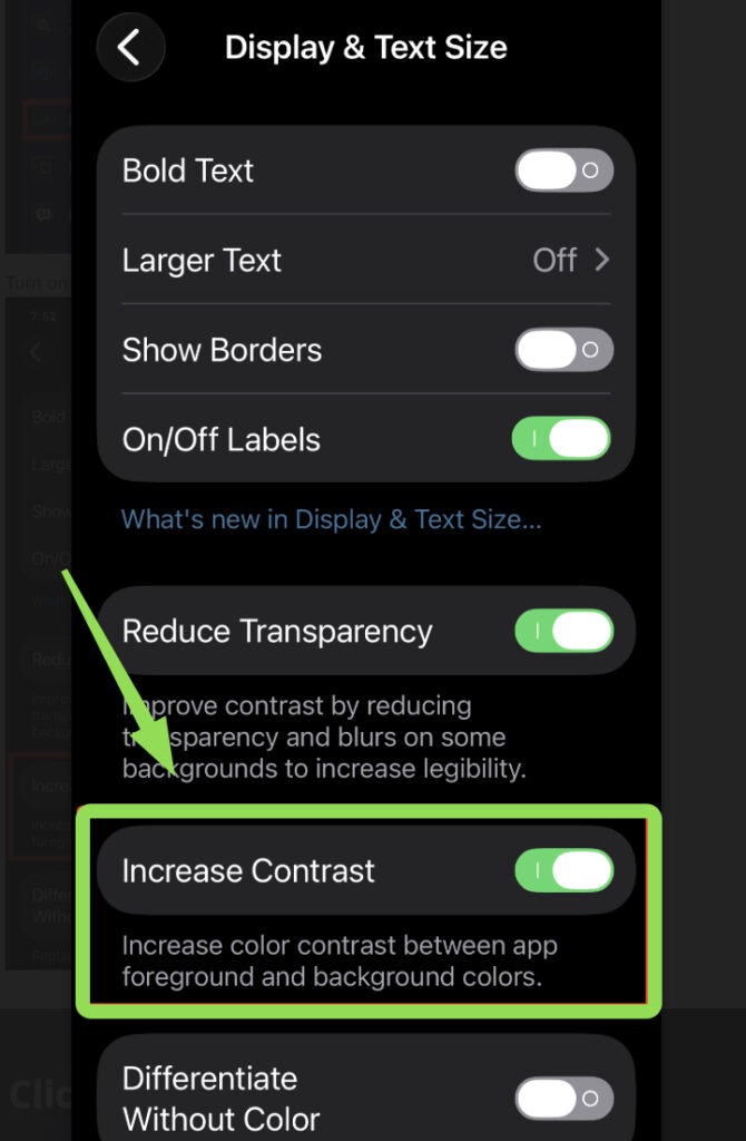
Once enabled, buttons and interface elements will appear clearer against their backgrounds.
3. Use Dark Mode
Dark Mode reduces bright interface layers and can make translucent effects less noticeable.
While it does not completely remove the Liquid Glass design, it often improves readability in menus and notifications.
Steps to enable Dark Mode
- Open Settings.
- Tap Display & Brightness.
- Select Dark under Appearance.
Dark Mode works especially well when paired with Reduce Transparency.
4. Disable Motion Effects
Motion effects in iOS sometimes amplify the Liquid Glass style by creating subtle animations and depth transitions.
Reducing motion can make the interface feel simpler and less distracting.
Steps to reduce motion effects:
- Open Settings.
- Tap Accessibility.
- Select Motion.
- Turn on Reduce Motion.
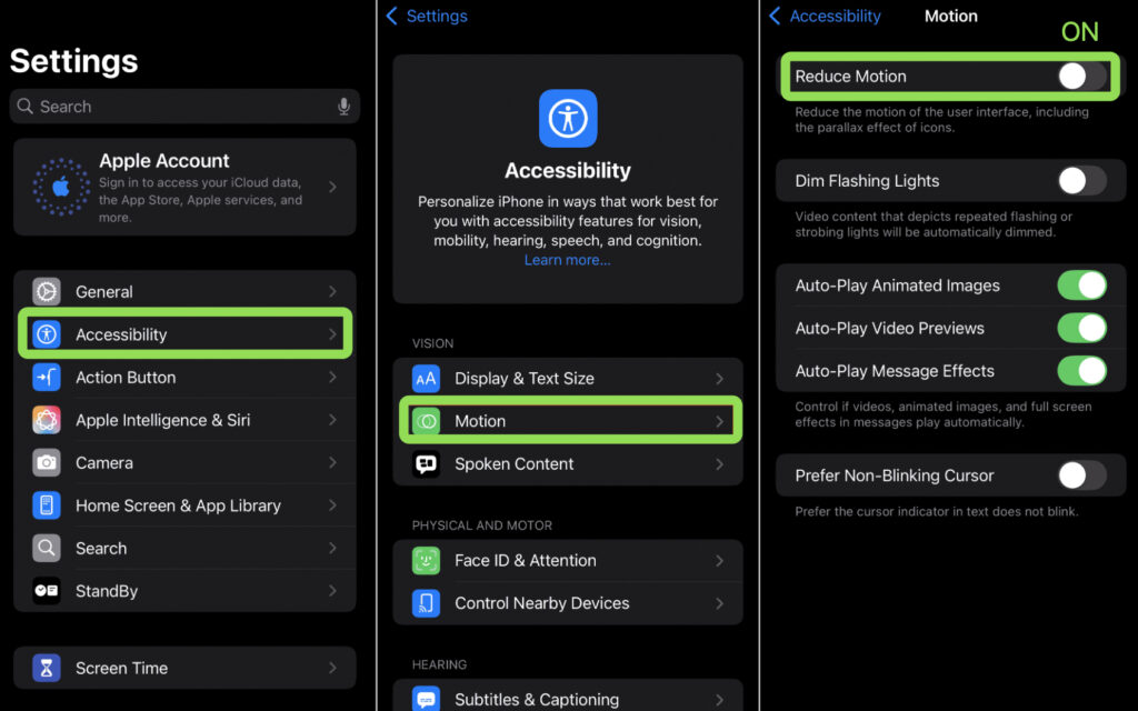
This removes many background animations and parallax effects.
6. Change Your Wallpaper
Busy wallpapers can make translucent interface panels harder to read. Using a simple background can significantly improve visibility.
Steps to change your wallpaper
- Open Settings.
- Tap Wallpaper.
- Select Add New Wallpaper.
- Choose a simple or darker background.
- Tap Set as Wallpaper Pair.
A clean wallpaper reduces the visual impact of transparency effects.
7. Reset Accessibility Settings
If display settings have been heavily modified, resetting accessibility preferences can restore default behavior.
Steps to reset accessibility settings
- Open Settings.
- Tap General.
- Select Transfer or Reset iPhone.
- Tap Reset.
- Choose Reset All Settings.
After resetting, you can reconfigure accessibility options as needed.
Tips
• Use Reduce Transparency for the biggest visual difference.
• Pair it with Increase Contrast for better readability.
• Choose simple wallpapers to reduce background clutter.
• Enable Dark Mode if bright panels are difficult to read.
• Disable motion effects if the interface feels too animated.
Make Your iPhone Interface Easier to Read
Apple’s Liquid Glass design adds a modern visual style to iOS, but it may not suit everyone. Transparency can sometimes make menus harder to read, especially on busy backgrounds.
Using accessibility features such as Reduce Transparency and Increase Contrast allows you to simplify the interface quickly. With a few adjustments, you can make your iPhone easier to read while keeping the overall design clean and comfortable.
Key Takeaways
The Liquid Glass effect in iOS introduces translucent interface elements that blend with the background. While visually appealing, it can reduce readability for some users. Enabling Reduce Transparency and Increase Contrast helps replace glass effects with solid backgrounds. These accessibility settings allow iPhone users to customize the interface for better clarity and comfort.
FAQs
You cannot fully disable the design system, but enabling Reduce Transparency significantly reduces the glass appearance.
In most cases, performance remains the same. Some older devices may even feel slightly smoother because fewer visual effects are rendered.
Apple uses transparency to create depth and make interface layers feel connected to the wallpaper and content behind them.
No. Dark Mode does not remove the effect but can make translucent panels less noticeable.
Some apps may display slightly different colors or backgrounds when accessibility features like Increase Contrast are enabled.
0 Comments