IOS 27 Apple Pay Redesign Fixes Checkout Card-Switching Problem
What You Need to Know
- IOS 27 redesigns Apple Pay checkout to fix card-switching confusion in mobile commerce.
- Swiping sideways cycles through payment cards; tapping opens full grid of payment options.
- Card balances and reward points now visible before confirmation, eliminating separate lookup steps.
- Previous design required locating buried button at sheet bottom to change payment method.
Apple’s iOS 27 quietly fixes one of the more reliably frustrating moments in mobile commerce: trying to switch a payment card during checkout and ending up in an address editor instead. That misdirection was baked into the old Apple Pay sheet design, and enough people hit it often enough that the redesign feels overdue.
The previous checkout flow had a logic problem. Tapping the card shown on screen, which is the obvious gesture, opened address editing rather than card selection. To actually change your payment method, you had to locate a separate button tucked at the bottom of the sheet. For anyone who has ever had to fix a stuck Apple Pay setup during onboarding, this kind of buried control will feel familiar.
The new behavior is more direct:
- Swiping sideways on the main checkout screen cycles through available cards
- Tapping the card directly opens a full grid view of all payment options
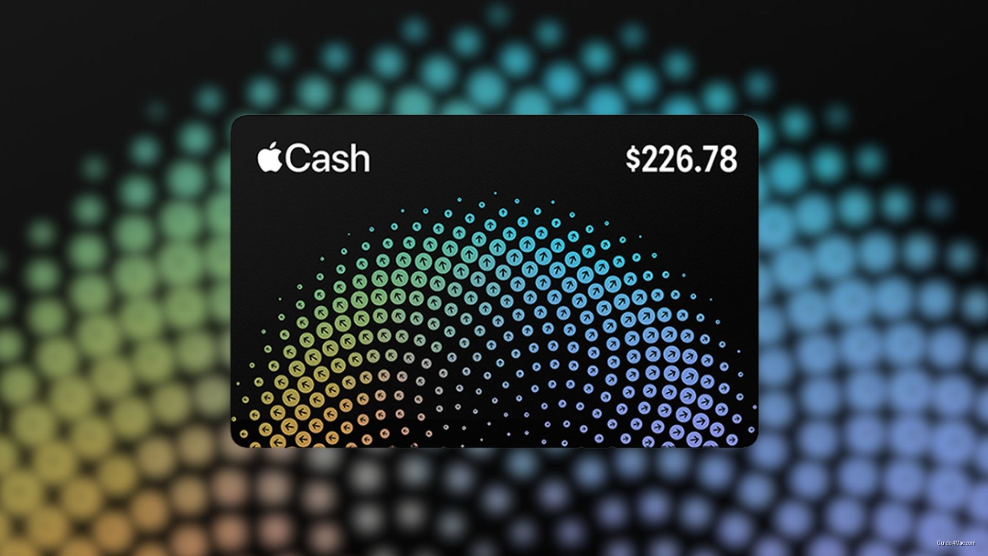
- Reward points, current balances, and pay later options appear on the payment sheet before confirmation
Developers retain control over which details surface, so what appears on the sheet can vary depending on what an individual app needs to complete a transaction.
The information density change is the less obvious but arguably more useful part of the update. Seeing a card balance or available rewards before tapping confirm removes a separate lookup step, the kind of small friction that adds up across repeated purchases. Apple is not inventing new payment concepts here, just reorganizing what was already present into a layout that matches how people actually think during checkout.
Whether the redesign holds up on the larger canvas of a foldable iPhone in landscape remains an open question, but on a standard screen the logic is straightforward: fewer taps, less confusion, same result.


0 Comments