WatchOS 27 Finally Unifies Find My Into One App
What You Need to Know
- WatchOS 27 unifies Find My into single app, consolidating three separate apps into one map view.
- Pinch gesture on Smart Stack enables one-handed widget selection without touching screen directly.
- Custom Wallet passes let users create QR/barcode passes for unsupported cards like library memberships.
- Call Context automatically surfaces relevant information like confirmation codes during phone calls.
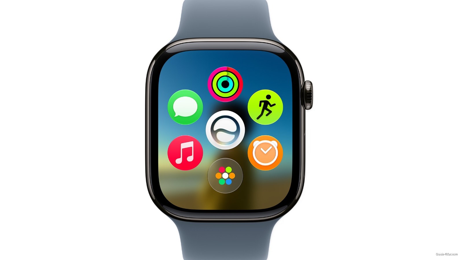
The headline feature in watchOS 27 is a dynamic app grid that reshuffles itself based on context, but the more telling detail is buried further down: Find My is finally becoming a single unified app, collapsing three separate apps (Find Devices, Find People, Find Items) into one map-centric view. Apple has let that fragmentation sit for years while users toggled between apps to locate a lost AirTag versus a missing family member.
The new pinch gesture for the Smart Stack is the kind of thing that sounds minor until you actually use a watch one-handed regularly. Tapping index finger and thumb together to select a widget without touching the screen directly addresses a real limitation, particularly for workouts, cooking, or carrying something. It extends the gesture vocabulary Apple introduced with double-tap on the Series 9 without requiring new hardware.
The custom passes feature deserves more attention than it is getting. Users can now create Wallet passes from any QR or barcode using their iPhone, which means a library card, gym membership, or loyalty card that never had official Apple Wallet support can now live on the watch. That closes a gap that third-party apps like Stocard have been filling for years.
Call Context is the sleeper feature here. When a user calls an airline, the watch can surface a confirmation code pulled from Mail automatically. Apple is essentially threading together apps that previously had no awareness of each other during a live interaction, which points toward a broader ambient intelligence direction without requiring the user to ask for anything.
The Liquid Glass readability fix is an implicit acknowledgment that the aesthetic introduced earlier caused real legibility problems. “More uniform refraction and better contrast” is Apple’s way of saying the initial implementation prioritized appearance over function.
Battery and Wi-Fi improvements round out the update alongside faster Music playback and app launches, the kind of list that signals Apple spent meaningful engineering time on fundamentals rather than features alone.

0 Comments